


C-Bay Smart Cities
Location
Shenzhen, China
Client
C-Bay Smart Cities
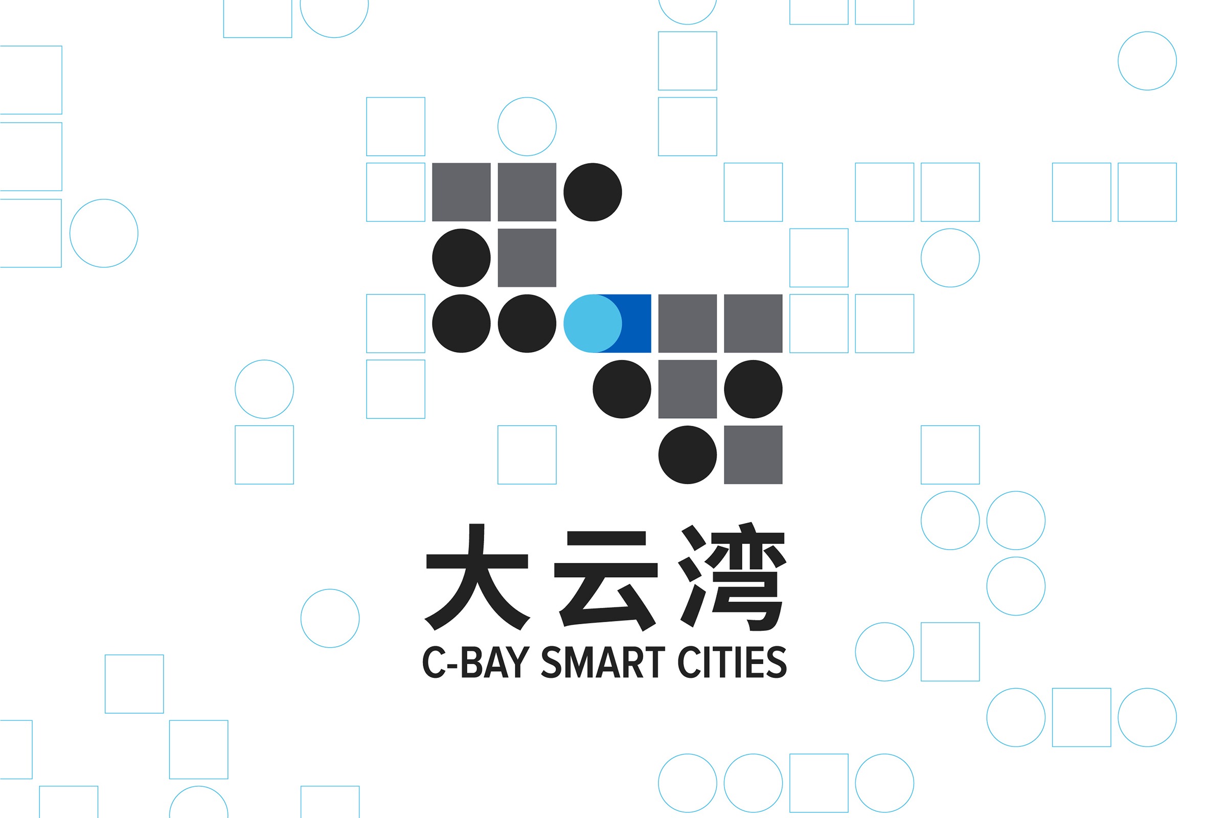
As part of its pivot toward smart architecture, GBA-based C-Bay Smart Cities has implemented a logo created by our Hong Kong brand experience team which emphasizes innovation inherent in its culture.
Combining eastern and western cultures, technology, and intelligence, the design embodies a joint venture of C Cheng Holdings -our parent company- and Beijing General Municipal Engineering Design & Research Institute Co. Ltd, dedicated to fostering smart cities and technological development in China.
Inspired by the western binary system, the foundation of electronics and technology, the team breaks letter “i” as in “innovation” into 1 and 0, which could also represent the dynamics between yang and yin in I Ching (the Book of Changes).
The numbers and yang and yin concept are merged and transformed into graphics, before being integrated with the 50th hexagram of I Ching -namely the Cauldron of Fire and Wind- which is the pattern the identity’s derived from.
The design implies its solid growth driven by a strategic collaboration, with an overlapped circle and square in the middle in blue sourced from the two founding firms’ logos.
Further, the idea is applied by the team to the brand’s collaterals and work environment for decoration and guidance.